Friday, 6 May 2016
Thursday, 5 May 2016

Wednesday, 4 May 2016

Friday, 29 April 2016
Thursday, 28 April 2016
Wednesday, 27 April 2016
Question 2 - How effective is the combination of your main product and ancillary tasks?
To start off with, the title screen used in my short film has the same title graphic used in both the review page and the poster. This immediately links all the the media products together because they are all obviously about the same thing. I used the same actors in the same clothes as in the short film for my main image on the review page. This is to make the article link directly to the short film.

 I have also used the directors cartoon face in the opening credits to my short film and the secondary image on my review page. My review page uses the same colour scene as my poster. This is to make them synergise without the obvious same titles and actors. For my poster, I haven't included real photos to link the actors directly to the film however, the graphics used look very much alike the actors sitting in positions seen in the short film. The fonts used in both my review page and poster are the same fonts as well. This is to further connote the relations between the two products.


Finally, the purpose of each products works together as well. The short film is the main products so the poster focuses on the short film. It advertises the film by using digital drawings of the things seen in the film and by giving the names of the short film, director and actors. My review also focuses on the short film but includes a photo of the director as well. This is a behind the scenes photograph which links to the short film. The text is about the film by commenting on the footage used and the storyline. I treated the director like a Youtuber and compared this videos to other fictional videos which helps links the director.


Finally, the purpose of each products works together as well. The short film is the main products so the poster focuses on the short film. It advertises the film by using digital drawings of the things seen in the film and by giving the names of the short film, director and actors. My review also focuses on the short film but includes a photo of the director as well. This is a behind the scenes photograph which links to the short film. The text is about the film by commenting on the footage used and the storyline. I treated the director like a Youtuber and compared this videos to other fictional videos which helps links the director.
Tuesday, 26 April 2016
Thursday, 21 April 2016
Question 4 notes
Research and Planning
- Youtube
- Apple Macs
- Blogger
Construsction
- Apple Macs
- Canon Legria camera
- Graphics Tablet
- iMovie
- Adobe Illustrator
- Adobe Indesign
- Adobe Flash
- Incompetech
- Microsoft Word
Evaluations
- Prezi
- Audacity
- iMovie
- Blogger
Wednesday, 20 April 2016
Question 3 notes
- Surveys - Feedback at the start of the year for ideas, target audience and genre.
- Positive feedback from friends after presenting ideas.
- Audience feedback about music choices.
- Feedback from co-director - solutions to problems during filming and editing.
- Presenting my work to another class of media students.
- Feedback on synergy between my products.
- Negative feedback got changed into improvements for me to make.
Tuesday, 19 April 2016
Question 2 notes
- House style
- Common themes
- Same colours - Blues
- Same fonts
- Fit for purpose
- Same titles
Monday, 18 April 2016
Question 1 notes
Short Film
- Under 45 minutes
- Twist Ending
- Title Screen
- Credits
- Location Shots
- Effects
- Transitions
- Actors
- Music
Poster
- Title
- Colour scheme
- Actors' Names
- Director's name
- Main images
- Background
- Small print
- Tagline
- Date
Review Page
- Title
- Text
- Main image
- Secondary images
- Colour scheme
- Bubbles
- Writer's name
Wednesday, 13 April 2016
Credits for the End
All of the short films that I have studied have credits at the end. This is to give recognition to everybody involved in the production of the film. I made my credits look like year book pages to fit with the school theme of my film. I got this idea from the film GBF because that film also ends with a yearbook. After the first page of credits, I have included clips of the actors behind the scenes. There are multiple reasons why I have done this. The first reason is because I want the audience to notice my actors as real people and not just the characters they play. I have also noticed that a lot of short films have a different video uploaded with behind the scenes footage and outtakes. I didn't have enough extra footage to make a whole second video so I decided to only include a shot of each actor during the filming process. Finally, some long films have bonus footage during the credits or after the credits. An example of this would be an avengers film.


Friday, 8 April 2016
Last Minute Editing
After filming the last of my footage, I needed to edit it into the work I have already done. This was easy enough to do because all of the shots were at the end of everything I had already done so it didn't change any of my previous footage. I also tweaked a few minor things that I noticed after watching my footage finally all together. Finally, I added the credits to the end of my film with the bonus footage. This is to finish my film. I am happy with my film. If any further changes are made, they will only be slight changes to the timings or transitions but for the most part, my short film is now finished.

Thursday, 7 April 2016
More Filming
My short film was mostly done but due to busy schedules, we were not able to film the last shots for a long while. I have finally managed to get this filming done during free periods in our school timetables. One actor however, did not have the same clothes so I decided to change a scene at the end. This scene now includes another joke about how dumb this character is.

Editing my Short Film
I found using imovie was a good enough software for my short film. I didnt need any fancy special effects so this free software did a good job. I was able to use all of my footage, music and transitions. Each feature is easily adjusted in the settings to make the footage the way you want it. For example:
Transitions
Transitions

Text screen

Imported footage

Music and sound Effects


Wednesday, 6 April 2016
Magazine Editing
I found editing my magazine to be quite a simple process. For the images, I used illustrator to paint them and then export them into indesign. This allowed be to adjust the position and size to fit what I want. Using the features in indesign, I was able to easily add the text and colour. Each item was on a separate layer to make it organised and easily adjustable. The tools made the software easy to use for my review page. For example:
Shapes and Text
Shapes and Text

Transform

Layers

Tuesday, 5 April 2016
Magazine Decision
I had made two different versions of my review page because I couldn't decide during making the page which layout to choose. Once I had saw both options, I decided to use the one with the real photograph. This is because the references I have looked at use real photographs rather than digital drawings. I also believe that there is a lot less blank space on the review page with the photo. I couldn't tell during planning my page which one I wanted to use because I planned it with labelled boxes. Once I had added all of the text, images and colours, I decided to chose the photograph. There is already enough synergy between my poster and review page by using the same colours, fonts and style without also having the same images.


Wednesday, 16 March 2016
Magazine Draft

This is my first draft of a magazine review page. Because I have mixed genres of magazines from the internet magazine and a film magazine, I have used boxed text with a smaller font. I have also included a page number in the bottom right corner. For the conventions of the internet magazine, I have used a bolder colour scheme by using a lot of shades of blue. I have also used bubbles for extra text to stand out and had the images interact the text boxes for the layout to look a little more fun. There is synergy with this article and the poster by using the same title image, the same image styles, and the same colours.
Wednesday, 9 March 2016
Magazine Review Page Conventions
Magazine Name - Some magazines keep their magazine name at the top of the page as a reminder of who published the review.
Title - The main heading at the top of the article. This is normally the film title.
Text - The writing reviewing the film in the article.
Main Image - A related image that takes up a lot of space in a review page. This makes the article look more appealing and obvious about the content.
Stand First - The small amount of text underneath the header that sums up the article.
Page Number - The number in one of the corners of the page.
By-line - The name of the person who wrote the article.
Bubbles and Buzz Words - These are normally in gossip/teen/internet magazines but because I am merging genres of magazine to appeal to the appropriate audience. These are used to make the page look more interesting by making key words or quotes stand out.
A Rating - A rating out of five stars and a small summary of why?
Friday, 26 February 2016
Magazine References
A lot of short stories/films are posted to youtube so I want to make my article have similar features as a youtube magazine as well as a film magazine. Both of these magazines are quite contrasting so it may be a little difficult to do so but I think I will be able to use bubbles and the layout of a youtube and internet magazine but use a similar colour scheme and house style as a film magazine. A youtube magazine has a fun layout with bubbles, buzz words and bright colours whereas a film magazine seems to be more orderly with darker colours. I am going to mix the conventions of both because it will then appeal to both film watchers and internet browsers.


Wednesday, 24 February 2016
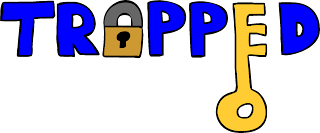
Trapped Poster

First of all, the title has the exact same appearance as the one featured in my short film. This is because I wanted to keep the house style the same so that the audience can make a connection between the poster and the short film. I have replaced letters in the title with images that I had drawn on the computer. The images represent the word trapped while also looking like the letters they are replacing to make it still be readable. A lot of the poster features the colour blue because I believe this colour symbolises sorrow and sadness which are the feeling you get when you feel trapped. I decided to use this style of art because I am able to add other relatable symbols without it seeming silly. For instance, the horse is only a small funny cameo in the short film which is why it is featured in the poster but if I used real images, it would look like the horse was a major part of the story line. The colour yellow stands out on the colours of blue I have used so I used it to highlight the unique selling points of the film; the actors. I have used a small blocky font for the small print because this is a key convention that is used on all film posters. To fill the plain parts of the background, I used a few patches of brickwork patterns to also represent the trapped feeling of being inside walls.
Thursday, 18 February 2016
Adobe Indesign
Adobe indesign is the desktop publishing software that I used to piece together my review page and my poster. I made the graphics in Adobe illustrator and using the features in Indesign, I was able to change the opacity, add bubbles, text and import other images. Indesign is able to show guidelines for you to follow to make the boxes the same size. It's a lot easier to work in indesign because the layers make it easy to reposition items and overlap features.


Wednesday, 3 February 2016
My Poster's Characters


Friday, 29 January 2016
Poster Design
After looking for other short film posters online, I found a style that I really liked and want to replicate for myself. Rather than using real shots of the actors, these posters had digital drawings of the characters by using only one colour but with different shades. Here are two examples of the posters.

 There are multiple reasons as to why I like these kinds of posters. For starters, the characters are noticeable as the person in the short film. Although it is not them and rather just a drawing. The characters can be seen with a trait the they have in the film also. For example, in strangers in a bed, the man is quite an angry man throughout which is clearly shown in the poster. Because the image is drawn rather than an actual photo, it can be altered a lot easily. For instance, in the tea chronicles, the man is drawn small and inferior to the man with the cup. Drawings can also be mixed and symbolic rather than true to life as shown by the strangers in a bed poster. The symbolism can mean multiple things depending on who looks at it so i will have to choose what patterns, shapes and objects to put into my poster to give the general message of being trapped. (Maybe like a key or something to do with being locked like a padlock)
 There are multiple reasons as to why I like these kinds of posters. For starters, the characters are noticeable as the person in the short film. Although it is not them and rather just a drawing. The characters can be seen with a trait the they have in the film also. For example, in strangers in a bed, the man is quite an angry man throughout which is clearly shown in the poster. Because the image is drawn rather than an actual photo, it can be altered a lot easily. For instance, in the tea chronicles, the man is drawn small and inferior to the man with the cup. Drawings can also be mixed and symbolic rather than true to life as shown by the strangers in a bed poster. The symbolism can mean multiple things depending on who looks at it so i will have to choose what patterns, shapes and objects to put into my poster to give the general message of being trapped. (Maybe like a key or something to do with being locked like a padlock)
Thursday, 28 January 2016
Posters - Key Conventions
Title- The name of the film. This is the biggest text on the poster to stand out to the audience.
Selling Line - Smaller text somewhere near the title. This sums up the film in a small phrase.
Main Image - The most important image of the poster. It is the biggest and clearest and normally contains the main actor(s) involved.
Secondary Images - Other images used on the poster that may be used to highlight other things in the film that didn't fit in the main image.
Background - The image or colour scheme used in the background. This often conveys the location of the film or the atmosphere.
Actors - The names of the main actors are in a smaller font than the title. These are used as unique selling points.
Director - The director's name is on there also a smaller unique selling point.
Company Logos - The logos of the companies involved with the production are often on the poster to give smaller details about the film.
Billing Blocks - The small print used on the poster to give details about who is involved and what companies are involved.
Wednesday, 13 January 2016
Change of Plan
After asking the school care taker, I have found out that my school no longer opens on a saturday. I had originally planned to film my shots on saturday but I now have to change my plan to film the main footage of my short story after school when my actors are available. This is a little inconvenient because my schedule revolved around the filming on saturday but I don't think the timing of the production will be delayed any later than 2 days. Because I need to film after school, I now need to make a few signs to put on the doors requesting people to use the other stairway while filming is in progress. I am going to film using a lot of different shots so if someone happens to walk through anyway, it won't disturb the production too much because I will only film small amounts at a time that I can piece together at a later date.
Subscribe to:
Comments (Atom)